More Than Letters: Designing Emotion Through Typography in 2025
In 2025, typography isn’t just communication; it’s character. Fonts are no longer quiet backdrops. They’re expressive tools that shape perception, pace, and personality across every touchpoint. From signage and packaging to digital interfaces and spatial branding, typography plays a leading role in how brands make people feel.
At Vie Studio, we approach branding and spatial design holistically, from typography and signage to materials and lighting, using type as a medium for emotion, energy, and identity. Here’s how typography is evolving in 2025, and how to use it with purpose.
1. Bold Type, Clear Intention
2025 is the year of confidence. Brands are stepping forward with typography that’s unapologetically bold, not just in weight, but in personality. Big, intentional type choices anchor brand voice, draw attention, and help cut through saturated visual environments.
What we’re specifying:
Heavy serif and neo-grotesque fonts used at scale
Monospaced or extended type for edge and attitude
Clean sans-serifs with generous spacing for impact


When used well, bold type says more with less; clarity becomes a design feature.
2. Playful Typography with a Human Edge
As design gets smarter, typography is getting friendlier. We’re seeing a resurgence in expressive typefaces that feel warm, witty, and characterful, designed to engage rather than intimidate. It’s a response to screen fatigue and sterile minimalism.
Trends we’re embracing:
Rounded or irregular letterforms with subtle quirks
Type with hand-drawn details or organic rhythm
Layered type styles mixed in playful compositions
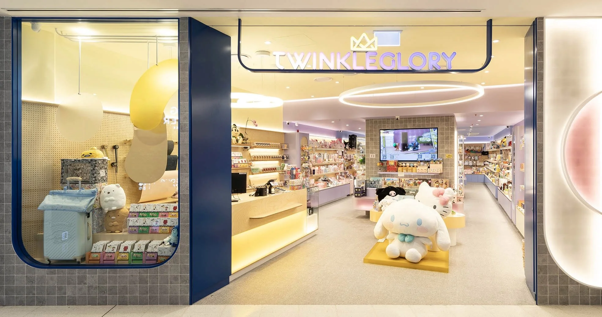
These choices make brands feel human, inviting curiosity and connection.
3. Emotion-First Type Hierarchies
Typography in 2025 is doing more than ordering information; it’s setting the emotional tone. Designers are now treating type as rhythm and mood: how it lands, moves, and changes across platforms and spaces.
Design strategies we’re using:
Hierarchies that reflect energy, not just size
Variable fonts that adjust weight or width dynamically
Typography as motion: subtle shifts, reveals, and fades in digital environments
Typography that adapts emotionally enhances usability and storytelling.
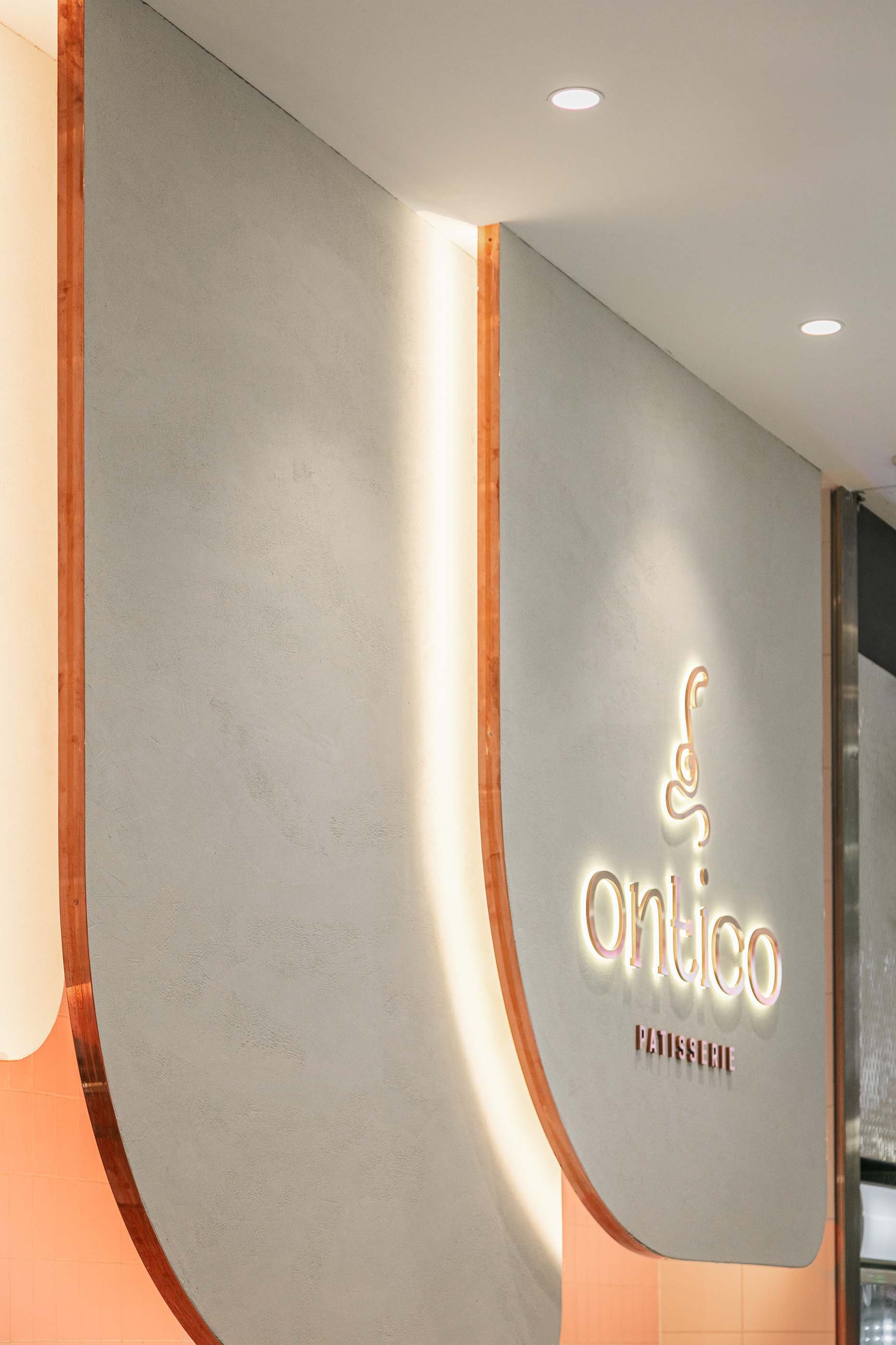
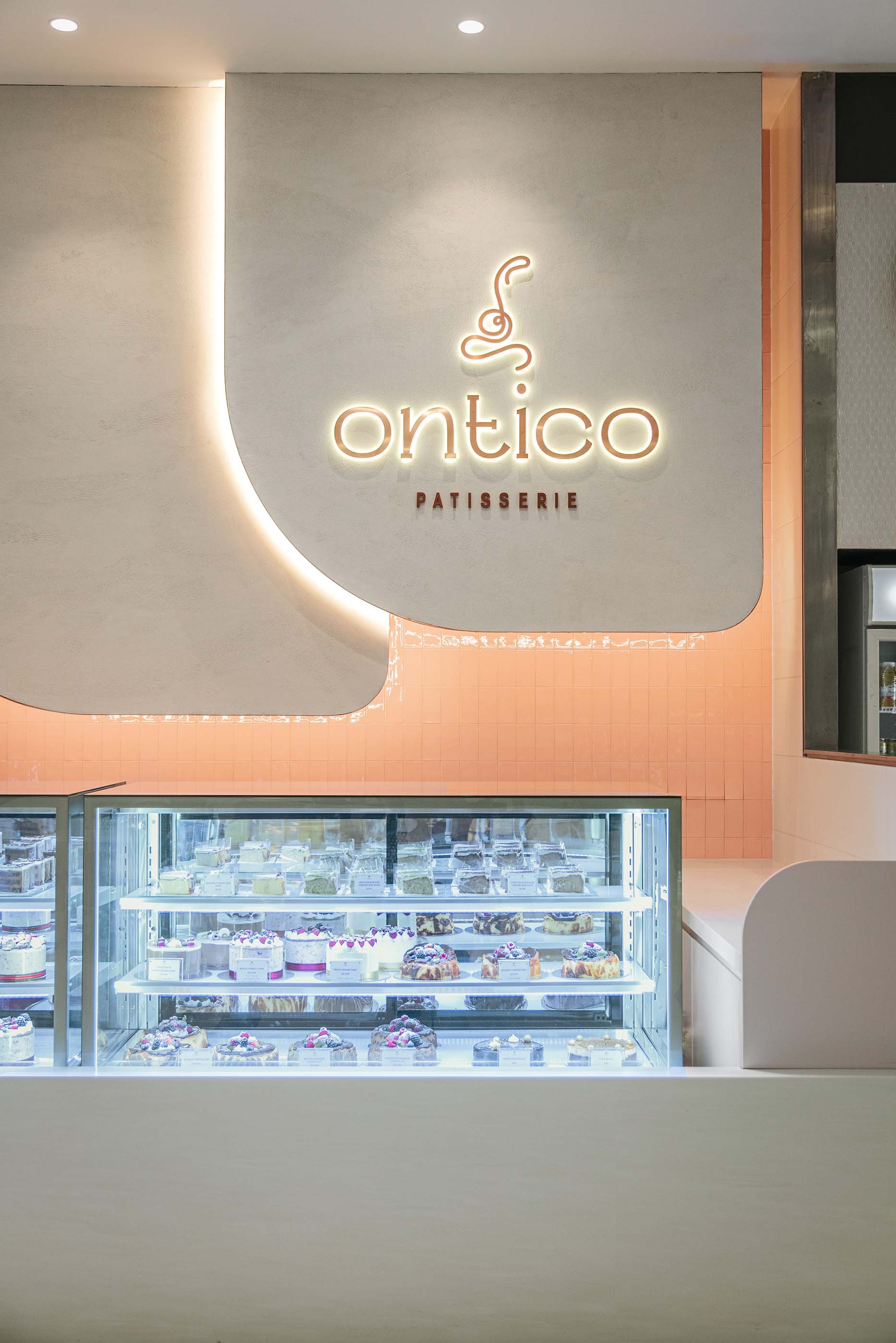
4. Type in Space: Physical Typography Matters
In spatial design, typography has evolved beyond signage; it’s become a form of spatial storytelling. Whether etched into walls, projected onto surfaces, or integrated into material layers, physical type anchors identity and guides experience.
We’re designing:
Dimensional lettering with tactile finishes (e.g., brushed metal, terrazzo inlay)
Environmental graphics that double as wayfinding and branding
Type that responds to materiality, curved forms on glass, tone-on-tone on timber


Great type in space is subtle, sculptural, and entirely on-brand.
How This All Comes Together at Vie Studio
From visual identity to branded environments, Vie Studio’s design services fuse strategy and craft to create experiences that connect. We integrate typography into brand systems, interiors, and digital experiences to tell a cohesive story—down to the finest detail.
Final Thought
Typography in 2025 is no longer passive; it’s performative. It speaks before a word is read. It directs flow, anchors identity, and invites feeling. Whether bold, playful, restrained, or emotional, typography, when crafted with intent, is one of the most powerful tools in a designer’s kit.

📩 Building a brand or space that deserves to be seen and felt?
Let’s design a visual language that speaks with clarity, feeling, and style.